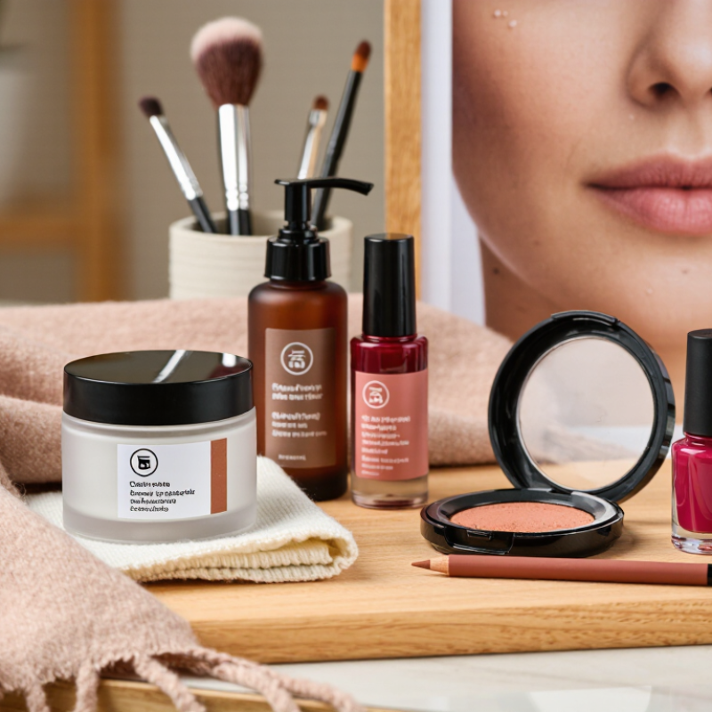
As summer fades, beauty inspiration needs a quieter, more practical direction. This guide explains how to transition a beauty board for fall without losing its original personality. Warm lighting, brushed textures, muted colors, and richer skincare visuals can create seasonal depth. Think cinnamon-toned blush, soft brown liner, berry nails, and moisturized skin beneath a wool scarf.
A strong fall beauty board should balance visual appeal with responsible choices. Use clear product images, verified ingredient information, and advice from qualified dermatologists or licensed beauty professionals. Avoid presenting every viral product as universally safe. Skin types differ. Patch testing still matters, especially when introducing exfoliating acids, retinoids, fragrance, or heavier formulas. Small details build trust, such as showing clean brushes, realistic skin texture, and correct product labels.
Your board can also reflect changing consumer expectations in 2026. Include refillable packaging, transparent sourcing, accessible shade ranges, and routines suited to cooler, drier weather. A cream cleanser beside a cotton knit fabric may communicate comfort more effectively than another polished studio image. Not every trend belongs here. That is part of the process.
Leave room for reflection. A color palette that looked elegant in August may feel flat by October. Some early ideas may need removing. That is not failure. It shows the board is responding to real seasons, real skin, and real use. The goal is not to predict every fall trend, but to build a credible visual guide that feels wearable, current, and thoughtfully edited.
Before changing a beauty board for Fall 2026, audit what is already there. Print every image, then sort by complexion, texture, color, finish, and mood. Remove repeated faces and vague “luxury” references. Note missing skin tones, mature skin, and practical wear. A board can look polished yet say nothing about real routines.
McKinsey’s The Beauty Market in 2023 projects the global beauty market may reach $580 billion by 2027, growing about 6% annually. That scale rewards clear choices, not visual clutter.
Review performance evidence too. Compare saves, comments, search terms, and product questions from the past season. Circana reported that U.S. prestige beauty sales grew 8% in 2024. This suggests continued demand for elevated experiences. Still, sales data cannot explain every emotional response.
Ask which images feel wearable at 8 a.m., under office lighting, or after rain. I often keep one beautiful reference too long. It may be attractive, but irrelevant.
For Fall 2026, write one working direction:
Build around three anchors: breathable complexion, brushed texture, and muted red-brown color. Add close-ups of pores, fingers, fabric, and mirror light.
Test the board across ages, undertones, and maintenance levels. Keep ten to twelve strong images. Leave room for revision. Forecasts are useful, not final.
How to Transition a Beauty Board for Fall in 2026?
For fall 2026, shift your beauty board toward burnished copper, smoked plum, moss green, and soft caramel. These shades feel seasonal without making every look appear heavy. Balance deeper colors with muted rose or warm beige. Your palette needs breathing room.
Texture will carry much of the seasonal mood. Pair blurred matte skin with satin eyelids, creamy blush, and softly reflective lips. Add brushed metallic details sparingly, especially around the inner eye or cheekbone. I recommend placing real fabric swatches beside makeup references. Velvet, brushed wool, and sheer mesh reveal the difference between soft and harsh finishes. Digital images can mislead.
Test every color in daylight and under warm indoor lighting. Undertones change quickly across different skin tones. A copper shade may look golden on one person and orange on another. Include varied complexion references in the board. That improves both accuracy and creative trust. Patch testing remains sensible when developing new product concepts. I often make the first draft too dark. It looks dramatic, but not always wearable. Reducing contrast by ten percent can create a more useful direction. Leave space for imperfect ideas. Some of them become the strongest visual cues.
Recommended editorial emphasis for Fall 2026, balancing seasonal color depth, tactile texture, and wearable beauty directions.
Use deep berry, muted plum, warm cocoa, and soft bronze to create a richer fall palette. Pair these colors with blurred finishes, satin skin, brushed brows, and softly layered textures for a modern seasonal transition.
How to Transition a Beauty Board for Fall in 2026?
A fall beauty board should feel edited, not overloaded. McKinsey’s Future of Beauty report identifies skincare as roughly 40% of the global beauty market. That makes skin the starting point, not an afterthought. Build the board around a calm, hydrated complexion, then add muted berry, roasted plum, and soft cocoa makeup references. Think sheer blush, brushed brows, and softly blurred lips. U.S. prestige beauty sales grew 8% in 2024, reaching $33.9 billion, according to Circana. Consumers are still spending, but value and versatility matter. I would save images showing one product used across cheeks and lips. My first draft usually becomes too beige. That needs correcting.
For skincare, show layered textures: a light essence, a barrier-supporting cream, and sunscreen under makeup. Avoid promising instant repair. Real skin has pores and uneven days. Hair inspiration can shift toward polished texture, low buns, loose waves, and warm brunette or copper references. Include close-up images of healthy-looking ends, not only dramatic cuts. For nails, replace summer brights with smoked cherry, taupe, olive, and translucent nude shades. Short, practical shapes may fit autumn wardrobes better. Euromonitor’s beauty research continues to emphasize personalization and multifunctional routines, so the board should show choices rather than one rigid trend. Leave a few imperfect references. A chipped edge, visible texture, or uneven wave can make the final direction more believable.
A practical, brand-neutral planning table built around seasonal color, texture, maintenance, and skin-hair comfort.
| Category | Fall 2026 Direction | Color / Finish | Key Ingredients or Techniques | Useful Measurements | Why It Works for Fall |
|---|---|---|---|---|---|
| Makeup Complexion |
Sheer, skin-like coverage with targeted concealing instead of a heavy full-face base. |
Soft satin finish Warm beige, neutral tan, muted rose |
Apply thin layers, press product into the center of the face, and leave natural skin texture visible around the perimeter. | 1 thin base layer Concealer only where needed Set mainly around the nose and under-eyes |
The satin texture balances cooler weather dryness with a polished seasonal appearance. |
| Makeup Eyes |
Smudged definition and softly diffused shadow rather than sharply graphic lines. |
Cocoa, espresso, olive, antique bronze Matte-to-satin blend |
Use a pencil or cream formula along the lash line, then soften the edge with a small blending brush. | Keep the deepest tone within 2–3 mm of the lash line for controlled definition. | Deeper earth tones create visual warmth without requiring a high-contrast black look. |
| Makeup Cheeks & Lips |
Choose one softly concentrated focal color: terracotta cheeks or a berry-toned lip. |
Terracotta, brick rose, cranberry, raisin Blurred cream or satin finish |
Tap blush onto the high points of the cheeks and diffuse the edges; blot lip color once for a lived-in finish. | Use a 1:1 balance: one dominant color family for cheeks or lips, with the other kept neutral. | Muted reds and browns visually echo autumn foliage and pair well with neutral clothing. |
| Skincare Barrier Support |
Move toward a simpler routine that prioritizes cleansing, moisturizing, and daily broad-spectrum sun protection. | Comfortable, non-stripped skin Low-fragrance or fragrance-free preference |
Look for humectants such as glycerin, emollients such as squalane, and occlusive ingredients such as petrolatum or dimethicone. | Cleanse up to 2 times daily as needed Moisturize after cleansing Use broad-spectrum SPF 30 or higher during daytime |
Cooler air, indoor heating, and wind can increase feelings of dryness and tightness. |
| Skincare Exfoliation |
Use a measured exfoliation schedule rather than layering multiple strong actives. | Smooth, calm, non-glossy radiance | Choose one exfoliating approach, such as lactic acid or salicylic acid, and avoid combining it with several other potentially irritating actives in one routine. | Begin 1 time weekly; increase only if the skin remains comfortable and free from persistent redness. | A slower schedule helps maintain smoothness while reducing the risk of over-exfoliation. |
| Skincare Hydration |
Create a hydrated base for makeup with lightweight layers instead of excessive product. | Fresh, supple finish without visible greasiness | Layer a water-binding product under moisturizer; apply moisturizer while the skin is slightly damp. | Allow approximately 2–5 minutes between skincare and makeup to reduce pilling. | A well-moisturized surface improves the appearance and wear of thin complexion products. |
| Hair Shape |
Use movement-focused layers, soft face-framing pieces, or a collarbone-length shape that works with natural texture. | Air-dried texture Soft volume Natural-looking separation |
Ask for layers suited to the hair’s density and curl pattern; avoid removing excessive weight from fragile ends. | Keep face-framing pieces long enough to blend into the rest of the cut; reassess shape every 8–12 weeks. | Flexible shapes transition well between humid early fall weather and drier indoor environments. |
| Hair Color & Care |
Favor dimensional, lower-maintenance color placements that grow out softly. | Chestnut, copper-brown, espresso, soft caramel accents | Use heat protection, condition the mid-lengths and ends, and limit high-heat styling when hair feels dry or brittle. | Apply heat protectant before every heat-styling session; keep hot tools moving and avoid repeated passes over one section. | Warm brunette and copper-brown tones complement fall neutrals while requiring less frequent full-color maintenance. |
| Nails Shape & Length |
Choose short-to-medium oval, squoval, or softly almond shapes for practical seasonal wear. | Clean edges Sheer neutral base Gloss or velvet-like shine |
File in one direction, seal the free edge, and use cuticle oil or hand cream regularly. | Keep free-edge length around 1–4 mm for a balanced, low-maintenance look. | Shorter shapes are practical for cooler-weather layers, daily tasks, and frequent hand care. |
| Nails Color Stories |
Build the board around grounded shades with one accent option for contrast. |
Oxblood, cinnamon, moss, taupe, deep navy, muted cream |
Try a single-color manicure, tonal French tips, fine micro-lines, or a restrained two-tone design. | Use no more than 2–3 shades in one design to preserve visual clarity. | Earth-derived colors coordinate easily with knitwear, denim, leather, and neutral outerwear. |
For a Fall 2026 beauty board, organize references by category before chasing a color story.
Create folders for complexion, eyes, lips, hair, skin, and tools. Then add practical tags such as office, evening, humid commute, travel, sensitive skin, and ten-minute routine. This method reflects real consumer behavior. McKinsey’s 2023 beauty report projects the global beauty market could reach about $590 billion by 2028, with roughly 6% annual growth. A larger market demands clearer decisions, not more scattered images.
For complexion, record coverage, finish, texture, and indoor lighting. For eyes, note placement, blending difficulty, and whether the look survives a long workday.
Lip references should include undertone, comfort, transfer risk, and reapplication needs. Hair images need useful details: parting, humidity control, length, and required tools.
I also separate inspiration from evidence. Clinical claims, ingredient information, and safety guidance should come from regulatory agencies, peer-reviewed research, or professional associations. NIQ’s 2024 State of Beauty report highlights continued digital growth, so screenshots need context, including date and source.
Keep a small “testing” section. Add photos after four hours, not only polished morning images. Some references fail in real life. Mine do too.
Fall light can flatten color, while indoor heating can expose dry texture. I would revise the board after wear tests, especially for climate, skin sensitivity, and time limits. The board becomes more useful when each image answers a practical question.
How to Transition a Beauty Board for Fall in 2026?
Review your beauty board before adding anything new. Remove colors that feel disconnected from cooler weather. Check every product image, texture note, and shade reference. Dated information can weaken reader trust. I review ingredient claims against reliable cosmetic safety sources. I also check whether the suggested routine suits dry, sensitive, or combination skin. One missed skin concern can make a beautiful board feel careless.
Refine the board with warmer textures and practical details. Think muted berries, soft browns, brushed metallics, and cream-based finishes. Include close-up visuals of smooth blending and softly defined lips. Fall lighting often looks flatter indoors, so explain how products perform near a window. Avoid promising perfect results. Real skin has pores, uneven tone, and occasional dryness. My own boards sometimes become too polished, and that is worth questioning. Beauty advice should remain useful, not intimidating.
Tips: Keep the palette focused. Limit repeated shades. Add one adaptable look for busy mornings. Label textures clearly, such as balm, powder, or stain. Maintain the board through the season by checking links, image quality, and product availability. Replace anything with unclear usage guidance. Store visual samples with creation dates. A quick monthly review helps keep the board accurate, hygienic, and relevant for Fall 2026.
Consider burnished copper, smoked plum, moss green, and soft caramel. Balance them with muted rose or warm beige. Keep some visual breathing room.
Combine blurred matte skin with satin eyelids, creamy blush, and softly reflective lips. Use brushed metallic accents sparingly. Velvet and brushed wool can clarify the intended mood.
Daylight and warm indoor light can change a color’s appearance. Copper may look golden on one complexion and orange on another. Lighting exposes weak choices.
Create sections for complexion, eyes, lips, hair, skin, and tools. Add tags like office, travel, humid commute, and ten-minute routine. This keeps inspiration connected to daily needs.
Record coverage, finish, texture, and lighting conditions. Also note how the look appears after several hours. Morning images can hide dryness.
Include undertone, comfort, transfer risk, and reapplication needs. A beautiful shade may become inconvenient during a long workday. That matters.
Note the parting, hair length, humidity control, and required tools. A style may look simple but need several tools. I sometimes underestimate that.
Add wear-test photos taken after four hours, not only polished morning images. Compare climate, skin sensitivity, and available time. Some references fail in real life. Mine do too.
Reduce contrast when deep colors dominate the first draft. A ten-percent reduction can make the direction more wearable. My first version is often too dark.
Place velvet, brushed wool, or sheer mesh beside makeup references. Physical textures reveal softness and harshness better than digital images. Screens can mislead.
Learn how to transition a beauty board for fall by first reviewing your existing inspiration and identifying which ideas still fit your personal style. For Fall 2026, create a clear direction using seasonal colors, richer textures, and emerging beauty moods that feel practical and wearable. Consider how warm, muted, deep, or unexpected tones can influence your overall look while keeping the board visually cohesive.
Refresh the board with ideas for makeup, skincare, hair, and nails, then organize each reference by category and purpose, such as everyday wear, special occasions, color inspiration, or technique ideas. This structure makes the board easier to use when planning seasonal routines. Finally, review the full collection, remove repeated or outdated images, refine the visual balance, and maintain the board throughout the season as your preferences and inspirations develop.