How to Create a High End Beauty Aesthetic?

Time:2026-09-12 Author:Liam
0%

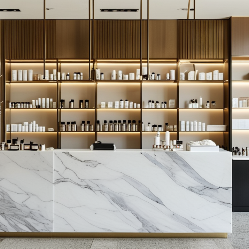
Creating a high-end beauty aesthetic begins with restraint, not excessive decoration. It combines refined visuals, consistent service, and details that feel intentionally chosen. The question “what makes a high-end beauty aesthetic” deserves a practical answer. Luxury often appears in quiet decisions: warm lighting, clean typography, balanced spacing, and carefully edited product displays. A marble counter may look impressive, but poor hygiene or rushed communication quickly weakens the experience. Beauty professionals should consider both appearance and performance.

This guide explores how to build an elevated aesthetic across branding, interiors, photography, packaging, and client interactions. It considers color temperature, material quality, skin-friendly presentation, and accessible design. Soft neutrals can create calm, while one deeper shade adds visual authority. Texture matters too. Think brushed metal, folded cotton towels, frosted glass, and natural daylight. Small details speak loudly. Yet expensive materials alone cannot establish trust. Reliable suppliers, transparent product information, and qualified professional practice remain essential.

The process also requires honest reflection. A polished image may attract attention but fail to represent the real service. That gap creates disappointment. High-end does not mean flawless or unapproachable. It should feel thoughtful, comfortable, and credible. This outline will examine what works, what often feels artificial, and where personal taste can mislead design choices. Some recommendations may need adjustment for different budgets, cultures, and customer expectations. That flexibility is important. An aesthetic becomes convincing when its visual promise matches the experience delivered.
How to Create a High End Beauty Aesthetic?

Defining the Core Elements of a High-End Beauty Aesthetic

A high-end beauty aesthetic begins with restraint, not excess. Its core elements are clarity, material quality, and controlled sensory detail. A quiet palette of ivory, charcoal, and muted bronze can create confidence without visual noise. Natural stone, brushed metal, thick glass, and soft directional lighting make the setting feel deliberate. Every surface should support touch, from a cool countertop to a weighted applicator.

This approach also reflects market behavior. McKinsey & Company’s 2023 beauty report projects the global beauty market could reach about $580 billion by 2027, with continued demand for premium experiences. Circana reported that U.S. prestige beauty sales grew 14% in 2023, reaching $31.7 billion. These figures suggest that consumers value more than decorative packaging. They notice consistency, service, and credible product information. A high-end aesthetic should therefore include visible expertise: precise shade guidance, hygienic tools, clear ingredient explanations, and staff who avoid exaggerated claims. Small details matter. A clean mirror matters. A calm voice matters.

Yet luxury design can become too cold. I have seen polished spaces lose warmth because every element looked untouchable. That is a useful warning. Leave room for human texture, such as handwritten care instructions or a softly worn wooden tray. The result should feel refined, but not staged. Premium beauty is strongest when visual elegance supports trust, comfort, and an informed decision.

Selecting a Refined Color Palette, Materials, and Textures

A high-end beauty space begins with restraint. Choose a quiet base palette: warm ivory, mineral beige, smoked taupe, or muted olive. These shades make skin tones appear more natural under controlled lighting. Add one deeper note, such as espresso brown, through cabinetry or a stone ledge. Avoid using too many accents. Luxury can disappear when every surface competes.

Material selection should feel deliberate, not merely expensive. Pair honed stone with brushed metal, ribbed glass, and soft boucle seating. These textures create contrast without visual noise. The Global Wellness Institute reported that the wellness economy reached 6.3 trillion dollars in 2023. This growth supports spaces that encourage calm, tactility, and personal care. McKinsey’s 2023 beauty report also projected the global beauty market could reach 580 billion dollars by 2027. The environment must therefore support both discovery and trust.

Tips: Test samples beside daylight and evening LEDs. Use matte finishes where fingerprints would show. Keep glossy surfaces limited to one focal zone. I often leave one element slightly imperfect, such as a handmade tray or irregular stone edge. It prevents the room from feeling clinical. Still, this choice needs discipline. Too much irregularity looks unfinished. Select textures people can understand through touch, not decoration alone. Keep pathways clear, and place mirrors where light falls evenly. Small details matter.

How to Create a High End Beauty Aesthetic? - Selecting a Refined Color Palette, Materials, and Textures

Element Type Selection Reference Data Finish or Texture Luxury Effect Recommended Application and Care
Primary Color Warm Ivory HEX #F3EDE4
RGB 243, 237, 228
Matte, chalky, low-sheen appearance Creates a bright, calm foundation and makes small spaces feel more open without the starkness of pure white. Use on walls, cabinetry, and large upholstered surfaces. Clean with a soft, lightly damp cloth and avoid abrasive products.
Secondary Color Taupe Beige HEX #B7A398
RGB 183, 163, 152
Soft satin or finely textured finish Adds depth and warmth while maintaining a restrained, sophisticated atmosphere. Suitable for feature walls, seating, curtains, and decorative panels. Pair with warm-white lighting between 2700K and 3000K.
Accent Color Deep Cocoa HEX #4A3832
RGB 74, 56, 50
Deep matte or softly polished finish Introduces visual contrast and gives the interior a grounded, intimate character. Use selectively on joinery, handles, frames, or one statement wall to prevent the space from feeling heavy.
Metal Accent Soft Brushed Brass Warm yellow-gold metal
Low-reflective finish
Linear brushed grain with subdued sheen Provides controlled highlights and a sense of craftsmanship without the visual intensity of mirror-polished metal. Use for taps, cabinet pulls, edging, lighting details, or frames. Wipe with a dry microfiber cloth and avoid harsh acids or bleach.
Natural Material Light Oak Natural hardwood veneer or solid wood
Visible grain variation
Wire-brushed or smooth matte finish Adds organic warmth and tactile authenticity, balancing stone, glass, and metal surfaces. Ideal for cabinetry, shelving, stools, or wall slats. Protect from prolonged moisture and direct sunlight.
Stone Surface Honed Limestone Calcium-carbonate natural stone
Low-gloss surface
Smooth, velvety, non-reflective texture Creates a quiet architectural backdrop with subtle natural variation rather than repetitive patterning. Use for counters, flooring, or wall cladding. Limestone is porous and should be sealed; avoid acidic cleaners such as vinegar or lemon-based products.
Glass Detail Fluted Clear Glass Vertically ribbed architectural glass
Translucent light diffusion
Repeating linear ridges with soft distortion Adds privacy, movement, and light play while keeping the overall composition visually light. Use for cabinet doors, partitions, shower screens, or display panels. Clean with a non-abrasive glass cleaner and a lint-free cloth.
Soft Furnishing Bouclé or Brushed Wool Looped or brushed natural-fiber texture
Warm hand feel
Nubby, dimensional, softly irregular surface Introduces softness and sensory richness, preventing hard surfaces from appearing clinical. Use for occasional chairs, benches, or cushions. Vacuum gently and follow the textile manufacturer’s cleaning instructions.
Lighting Layered Warm Lighting 2700K–3000K color temperature
CRI 90 or higher preferred
Diffuse ambient light with focused accent lighting Reveals material depth, softens shadows, and supports accurate yet flattering color perception. Combine ceiling, wall, and task lighting. Use dimmers where possible to adjust mood and prevent glare on polished surfaces.

Note: Natural stone, wood, and textile appearance varies by source, batch, grain, and lighting conditions. Always review physical samples before final selection.

Designing Consistent Visuals Across Beauty Touchpoints

A high-end beauty aesthetic begins with consistency, not decoration. Every touchpoint should feel related, from the website homepage to the treatment room. Choose a restrained color palette, two complementary typefaces, and one clear image style. Soft shadows, close-up skin textures, and generous spacing can suggest care without feeling excessive. Keep the details deliberate.

In practice, I would build a visual guide before creating content. It should define lighting, crop styles, button shapes, tone of voice, and background materials. A booking page should feel as considered as printed appointment cards. Staff uniforms, window signage, and social posts also need visual alignment. Avoid copying trends too closely. They often age quickly. A slightly imperfect image may feel more trustworthy than an overly retouched one. Still, test every choice with real users, because personal taste can hide confusing design.

Tips: Photograph the same model in consistent light. Check colors on both phones and printed cards. Use one recognizable detail, such as a curved line or warm stone texture. Review your visuals quarterly. Ask whether they still reflect the actual service. If the space feels calm but the booking page feels rushed, the aesthetic is not consistent yet. Small mismatches matter.

Applying Premium Photography, Lighting, and Brand Styling

How to Create a High End Beauty Aesthetic?

Applying Premium Photography, Lighting, and Brand Styling

A high-end beauty aesthetic begins with controlled visual decisions. Premium photography is not simply about expensive equipment. It depends on clean composition, accurate color, and deliberate detail. I usually shoot with a stable tripod and a macro lens. This reveals powder texture, fine highlights, and realistic skin finishes. Keep textures believable. A calibrated monitor also matters because soft neutrals can shift during editing. Review every image at full size before approving the final color.

Lighting should shape the product without making it look artificial. A large soft source creates gentle shadows across bottles, creams, and skin. A white card can open dark edges, while a black card adds definition to glossy surfaces. For reflective objects, move the cards instead of increasing exposure. Change one variable at a time. I once overlit a serum bottle and removed every useful contour. It looked polished, but strangely flat. That mistake changed how I test light.

Brand styling connects each photograph into one recognizable visual language. Choose two or three supporting colors, then repeat them through surfaces, props, and backgrounds. Natural stone, brushed metal, and translucent glass can suggest quality without overwhelming the product. Leave intentional empty space. It gives the composition confidence. Props should support the beauty story, not compete with it. Some of my strongest images came from simpler sets, although I still tend to add too many objects during early styling. Distance, restraint, and consistent editing often create the luxury that decoration cannot.

Refining the Aesthetic Through Feedback and Quality Control

How to Create a High End Beauty Aesthetic?

Refining the Aesthetic Through Feedback and Quality Control

A high-end beauty aesthetic grows through controlled observation, not expensive decoration. In studio reviews, I examine makeup, lighting, skin texture, color balance, and composition together. A polished image should feel intentional without appearing artificial. Feedback must come from more than one viewpoint. Clients notice comfort and authenticity. Makeup artists notice blending and proportion. Photographers notice shadows, reflections, and tonal consistency.

Small details matter. I review images under daylight and neutral studio lighting. I check whether foundation settles around the nose or exaggerates dry areas. I inspect eyeliner symmetry at close range. I also confirm that tools are clean and products are handled hygienically. A simple checklist prevents attractive styling from hiding technical weaknesses. It is not glamorous work.

My process still has flaws. I once approved a close-up that looked balanced on my monitor, but the highlights appeared harsh on another screen. That mistake changed my quality control routine. Now, I request independent reviews and compare calibrated displays before publishing. I record every adjustment, including changes that seem minor. However, excessive correction can remove natural character. A visible pore is not automatically a defect. The strongest aesthetic usually comes from disciplined refinement, honest feedback, and decisions that remain consistent across different viewers and environments.

FAQS

What defines a high-end beauty aesthetic?

It relies on restraint, clear materials, quiet colors, and controlled sensory details. Excess weakens confidence.

Which colors suit a refined beauty space?

Warm ivory, mineral beige, smoked taupe, and muted olive create a calm foundation. Add one deeper shade, such as espresso brown.

Which materials create a premium feeling?

Combine honed stone, brushed metal, ribbed glass, thick glass, and soft fabric. The contrast should feel deliberate, not expensive for its own sake.

How should lighting be handled?

Use soft directional lighting and even mirror illumination. Test materials in daylight and evening LED light.

Why do textures matter in beauty design?

Touchable textures make the space feel real. A cool countertop, weighted applicator, or boucle seat adds sensory depth.

How can a beauty space build customer trust?

Show practical expertise through shade guidance, hygienic tools, clear ingredient explanations, and careful claims. A clean mirror matters.

Can luxury interiors feel too cold?

Yes. Perfect surfaces may feel untouchable. Add warmth with handwritten care instructions, a wooden tray, or one gently worn detail.

Is imperfection useful in a premium setting?

A handmade tray or irregular stone edge can soften the room. Too much irregularity, however, may look unfinished.

How should glossy surfaces be used?

Limit gloss to one focal area. Use matte finishes where fingerprints would appear.

What practical details should not be overlooked?

Keep pathways clear and place mirrors where light falls evenly. Beauty needs comfort, not just appearance.

Conclusion

Creating a high-end beauty aesthetic begins with a clear understanding of what makes a high-end beauty aesthetic feel distinctive, refined, and trustworthy. It combines thoughtful visual direction with a strong sense of balance, using an elegant color palette, quality materials, and layered textures to communicate sophistication. Every detail, from typography and packaging to interiors and digital layouts, should support the same carefully defined identity.

Consistency across all beauty touchpoints is essential for creating a polished experience. Premium photography, controlled lighting, and intentional styling can highlight products and convey a sense of care without appearing excessive. The aesthetic should also be reviewed through customer feedback, team evaluation, and ongoing quality control. By refining colors, imagery, materials, and presentation over time, a beauty concept can remain cohesive, memorable, and elevated while still feeling relevant and welcoming.
Liam

Liam

Liam is a dedicated marketing professional with a profound expertise in the industry, where he excels at highlighting the unique advantages of our core products. With a keen understanding of market trends and consumer needs, Liam frequently updates our company’s professional blog, providing......