How to Choose Colors for a Beauty Board in 2026?

Time:2026-09-07 Author:Aria
0%

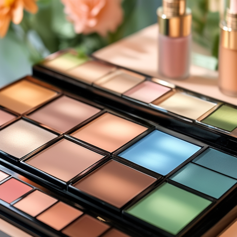
In 2026, a beauty board must do more than look attractive. It should guide attention, express product benefits, and support confident purchasing decisions. Learning how to choose colors for a beauty board requires both visual judgment and evidence. McKinsey’s Beauty Market in 2023 report projected that the global beauty industry could approach $580 billion by 2027. That growth increases competition for every shelf, screen, and salon consultation.

Color becomes a practical business tool. Soft peach can suggest warmth and approachability. Deep green may signal botanical care, while clean blue can communicate freshness. These meanings are not universal. Cultural context, lighting, packaging materials, and skin-tone representation can change the result. Leatrice Eiseman, executive director of the Pantone Color Institute, has said, “Color is the visual component that people remember most about a brand.” Her observation supports a careful, recognizable palette rather than random trend chasing.

NIQ’s State of Beauty reporting has also highlighted continued global beauty growth and strong consumer interest in wellness, personalization, and value. These themes can influence a board’s color direction, but they should not replace testing. A palette that looks refined on a laptop may feel dull under retail lighting. That happened in one early concept review. The beige background softened the imagery, yet reduced product contrast. It needed correction.

This guide examines contrast, emotional cues, accessibility, seasonal relevance, and color consistency. It also questions easy assumptions. Trendy is not always memorable. Bright is not always persuasive. The strongest beauty board usually balances sensory appeal with measurable clarity.
How to Choose Colors for a Beauty Board in 2026?

Define the Purpose and Audience of Your Beauty Board

How to Choose Colors for a Beauty Board in 2026?

Define the Purpose and Audience of Your Beauty Board

A beauty board needs a clear job before it needs attractive colors. Decide whether it will guide skincare education, present a makeup concept, or support a salon consultation. Each purpose changes the visual language. A calm educational board may use soft blue, warm white, and muted green. A creative campaign may need stronger contrast and sharper accents.

Study the audience with care. Consider age, cultural background, visual preferences, and viewing habits. A board for teenagers might welcome energetic coral and lilac. A professional training board may need restrained tones and clear labels. Check how colors appear on phones, printed cards, and bright studio screens. I have seen pale beige text disappear under strong lighting. That mistake made the board look unfinished.

Contrast supports trust and accessibility. Use dark text on a light background, then test the design in grayscale. Avoid relying on color alone to separate product steps or skin concerns. Add labels, icons, or spacing. Keep the palette focused, perhaps with one main color, one supporting shade, and one accent. Too many colors can weaken the message. I still revise my palettes after testing them with real viewers, because personal taste can hide confusing choices.

How to Choose Colors for a Beauty Board in 2026? - Define the Purpose and Audience of Your Beauty Board

Color planning matrix for matching visual mood, audience expectations, accessibility, and beauty-board content goals.

Beauty Board Purpose Primary Audience Desired Impression Dominant Color Supporting Color Accent Color Recommended Text Color Text Contrast Target
Ingredient-focused skincare education Readers comparing routines and product functions Clean, transparent, evidence-led, and calm #EAF4F0 #C9DDD5 #8A5A44 #263A35 At least 4.5:1
Inclusive complexion and shade education People seeking undertone, depth, and shade guidance Welcoming, representative, practical, and confidence-building #F3E4D7 #C98F72 #70433B #34201D At least 4.5:1
Bridal or occasion makeup inspiration Clients planning polished, long-wear looks Romantic, refined, soft, and timeless #FFF7F3 #E7C6C1 #A65D63 #4A292D At least 4.5:1
Sensitive-skin and barrier-care guidance People prioritizing comfort, simplicity, and low-irritation routines Gentle, reassuring, low-stress, and trustworthy #F2F0E8 #D6D9C8 #66735B #30382C At least 4.5:1
Trend-led editorial beauty board Visually driven audiences exploring emerging aesthetics Expressive, current, energetic, and shareable #241C2C #6D4C7D #E7A7C1 #FFFFFF At least 4.5:1
Professional consultation or service menu Clients comparing treatments, timelines, and outcomes Organized, premium, clear, and decision-friendly #F5F1EC #D8C5B5 #8B684D #302820 At least 4.5:1
Men’s grooming and minimalist routine guide Readers who prefer direct, functional, low-complexity advice Confident, efficient, modern, and understated #E8ECEB #AABAB7 #3E6264 #243637 At least 4.5:1
Seasonal self-care and wellness board People looking for approachable routines and mood inspiration Warm, optimistic, restorative, and easy to revisit #FFF2D9 #F2C58B #B45F3C #4B2C24 At least 4.5:1
Accessibility note: Use a minimum contrast ratio of 4.5:1 for normal text and 3:1 for large text. Reserve accent colors for highlights, icons, borders, or short labels when they do not provide sufficient contrast for body copy.

Choose a Color Psychology Framework for Beauty Branding

How to Choose Colors for a Beauty Board in 2026?

Choose a Color Psychology Framework for Beauty Branding

A beauty color palette should begin with emotion, not decoration. Color psychology offers a useful framework, but it is not a universal formula. Soft peach can suggest warmth and care, while deep blue may communicate calm expertise. These meanings can change across cultures, age groups, and personal experiences.

Define the desired response before selecting swatches. Do you want the viewer to feel refreshed, protected, confident, or curious? Choose one primary emotional direction, then support it with a secondary color and a neutral tone. For example, muted green, warm cream, and charcoal can create a grounded, botanical mood. Keep the contrast clear. Small text must remain readable on mobile screens and printed cards.

Use physical details to test the board. Place the colors beside frosted glass, brushed metal, natural skin tones, or glossy packaging materials. Observe them under daylight and warm indoor light. They may behave differently. Test it.

A practical framework should include cultural review and accessibility checks. Avoid assigning one emotion to every audience. Beauty is personal, and psychological responses are influenced by memory and context. I would also question overly perfect palettes. A slightly unexpected accent can feel more human, although it may weaken visual harmony. Record the reason behind each color choice, then test the board with real viewers before finalizing it.

Build a 2026-Relevant Color Palette with Core and Accent Tones

A 2026 beauty board should begin with a flexible core palette, not a single seasonal shade. McKinsey’s 2023 beauty market analysis projects the global sector could approach $580 billion by 2027. That scale suggests a practical direction: create colors that feel personal, adaptable, and easy to use across skincare, makeup, and wellness visuals.

warm ivory
softened clay
deep espresso

Start with three core tones: warm ivory, softened clay, and deep espresso. They create a grounded base without appearing overly clinical. Add two accent tones, such as mineral blue and muted chartreuse. These colors can suggest clean water, botanical ingredients, and renewed energy. Keep accents limited to roughly 10–15% of the board. Too much contrast may make the visual language feel noisy.

Recent consumer research also supports calmer, more tactile beauty communication. A 2024 consumer beauty report from Circana recorded continued growth in prestige beauty sales, while shoppers increasingly examined product value and sensory appeal. Use matte paper textures, close-up skin details, and small color chips beside product imagery. Test the palette on mobile screens. Colors often lose warmth there.

My first instinct is usually to add more accents, but that weakens hierarchy. A less perfect board may perform better when the core tones remain visible and memorable.

Check Color Harmony, Contrast, Accessibility, and Cultural Meaning

How to Choose Colors for a Beauty Board in 2026?

A beauty board should feel attractive before it feels trendy. I usually begin with one dominant color, one supporting shade, and a quiet neutral. This creates hierarchy without making product details compete. Check color harmony by comparing warm and cool tones, then test the palette beside skin tones, textures, and natural lighting. A soft peach may feel elegant on screen but appear overly orange beside real skin.

Contrast protects clarity. Dark text on a pale background is usually easier to read, while thin white text can disappear over glossy images. Use a contrast checker and test the board on a phone, tablet, and printed sample. Accessibility is not decoration. It helps people with low vision, color-vision differences, or tired eyes. Never use color alone to show prices, categories, or warnings. Add labels, patterns, or clear shapes.

Tips: View the palette in grayscale. If sections blend together, increase contrast. Leave enough space around text. Ask someone unfamiliar with the project to identify the main message. Their confusion is useful evidence. Cultural meaning also deserves care. White, red, purple, and yellow can suggest different emotions or traditions across regions. Research the audience instead of trusting personal assumptions. I once favored a beautiful lavender combination that felt calm to me, but user feedback found it cold and distant. That mistake still influences my testing. Color decisions need evidence, not confidence alone.

Test, Refine, and Document the Final Beauty Board Colors

How to Choose Colors for a Beauty Board in 2026?

A strong beauty board begins with a clear color purpose. Decide whether the palette should feel fresh, calming, dramatic, or luxurious. Then collect physical swatches, product samples, and neutral cards under daylight. Do not trust one screen. Its brightness can distort soft beige and muted coral. I usually test colors beside skin-tone references and white paper. This reveals unwanted yellow, gray, or blue undertones. My first board often looks attractive on screen but feels flat in person. That mistake is useful. It reminds me to test the palette in real settings.

Tips: Photograph the board in morning light, office light, and warm indoor light. Record the date, light source, sample material, and color adjustment. Leave the board overnight before judging it again. Small changes matter. A pale pink may disappear on textured paper, while a deep brown can dominate the entire layout. Ask two independent reviewers to describe the mood without seeing your original brief. Their words may expose a confusing color relationship.

Refine the palette by changing one color at a time. Keep a version history with simple labels, such as A, B, and final review. Include color values, material notes, and approved usage examples. A reliable record prevents accidental substitutions during production. Check contrast between neighboring shades, especially for readable labels and digital presentations. I sometimes remove a favorite color because it weakens the full composition. That decision feels disappointing, but harmony matters more than attachment. Before approval, print the final board at its intended size and inspect it from arm’s length. My judgment is not perfect. Documentation helps correct that weakness.

FAQS

: What should a 2026 beauty color palette include?

: Begin with three core tones: warm ivory, softened clay, and deep espresso. Add mineral blue or muted chartreuse as accents.

How much space should accent colors occupy?

Keep accents near 10–15% of the board. Too much contrast can make the layout feel noisy.

How can I make the palette feel tactile?

Use matte paper, close-up skin details, and small color chips. Texture can make soft colors feel more realistic.

Why should I test colors on different screens?

Mobile screens often reduce warmth. A gentle beige may look gray or flat there. Test before approving it.

Which lighting conditions should I use during testing?

Photograph the board in morning light, office light, and warm indoor light. Lighting changes subtle undertones.

How can I detect unwanted color undertones?

Place samples beside skin-tone references and white paper. This reveals unwanted yellow, gray, or blue shifts.

Should I change several colors at once?

Change one color at a time. Otherwise, you may not know which adjustment improved the composition.

How can I check whether the final board works?

Print it at the intended size and inspect it from arm’s length. Ask two reviewers to describe its mood independently.

What should I record during palette development?

Document color values, materials, lighting, dates, and approved uses. Keep versions labeled clearly, such as A, B, and final review.

What if my favorite color weakens the design?

Remove it if necessary. Personal attachment can hide poor harmony. My judgment is not perfect, so testing matters.

Conclusion

Learning how to choose colors for a beauty board in 2026 begins with defining its purpose and audience. Consider whether the board should communicate freshness, luxury, softness, confidence, or innovation, and identify the emotions and expectations of the intended viewers. Use a clear color psychology framework to connect visual choices with the desired beauty message, while remaining flexible enough to reflect evolving preferences and cultural differences.

Build the palette around a dependable core color supported by complementary accent tones, then evaluate harmony, contrast, readability, and accessibility across digital and printed formats. Color meanings can vary between cultures, so review the palette from multiple perspectives before finalizing it. Test the selected colors in realistic layouts, compare alternative combinations, and refine any tones that feel unbalanced or unclear. Finally, document color values, usage guidelines, contrast considerations, and approved combinations so the beauty board remains consistent, adaptable, and relevant throughout 2026.
Aria

Aria

Aria is a dedicated marketing professional with a deep passion for innovative strategies and a keen understanding of our company's product offerings. With a wealth of experience in the industry, Aria excels at crafting engaging content that highlights the unique features and benefits of our......